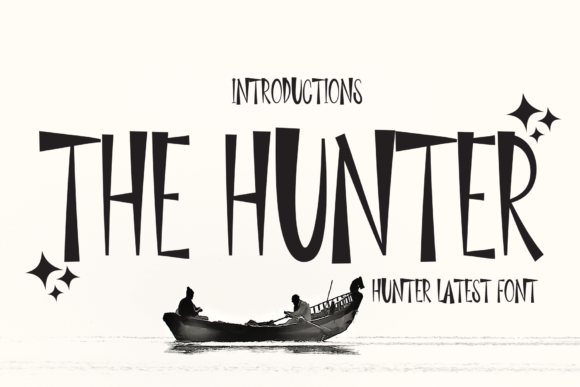
The Hunter Display Font for Digital Branding
It started with a hero section that felt just a little too safe. I’d been iterating on a boutique coaching site—clean layout, thoughtful spacing, strong imagery—but the headline lacked personality. Not warmth, not energy, not that subtle spark of distinction. So I swapped in The Hunter. Instantly, the page exhaled. Not louder—but clearer. Like swapping a standard lightbulb for one with just the right color temperature: same function, deeper resonance.
A Display Font That Anchors, Not Distracts
The Hunter is a display font built for intention—not ornamentation. Its charm lies in confident simplicity: slightly condensed proportions, balanced x-height, and gentle contrast between thick and thin strokes. It’s cool without being aloof, structured without rigidity, and distinctly modern without chasing trends. Think of it as the kind of typeface you’d choose for a brand that values authenticity over flash—where clarity meets quiet confidence.
I tested it across real web contexts: a product landing page headline layered over a muted lifestyle photo, a “Book a Session” CTA button on a dark gradient, and section headers in a course sales page. In every case, The Hunter held its own—not by shouting, but by standing still with purpose. It doesn’t compete with imagery or interface elements; it elevates them.
How It Performs Where It Matters Most
On mobile? Crisp at 32px and up. I ran quick visual checks across iOS Safari and Chrome on Android—no blurring, no hinting issues, no awkward letter-spacing collapse. At smaller sizes (below 24px), legibility softens, especially in bold weights, so I reserved it strictly for headings, banners, and high-impact accents—not navigation labels or form fields.
For responsive layouts, I used The Hunter only above the fold and in primary hierarchy zones. Its visual weight makes it ideal for hero titles, section intros (“What You’ll Learn”, “Meet Your Guide”), and branded callouts (“Limited Seats Available”). On desktop, it shines at 48–64px with generous letter-spacing (0.5–1.0px). On mobile, I scaled down to 32–40px and tightened tracking slightly—still highly legible, still unmistakably The Hunter.
One surprise: it works beautifully over image overlays—even semi-transparent ones. The stroke contrast holds up well against texture and gradient, unlike some ultra-thin or overly stylized display fonts that vanish into noise.
Where It Fits—and Where It Doesn’t
The Hunter is not a body font. Not a menu font. Not a caption or footnote typeface. And that’s its strength. It’s designed for display use: short, meaningful bursts of text where tone and identity matter most.
- Perfect for: Hero headlines, landing page titles, section headers, branded buttons, testimonial quotes (as large pull-outs), logo lockups (when paired with a simple sans serif for sublines), and digital brand kit assets.
- Not suited for: Paragraph text, form inputs, table data, dense dashboard UIs, accessibility-critical labels (e.g., error messages), or anything requiring WCAG AA contrast at small sizes without careful background control.
I tried using it for a secondary navigation bar—quickly reverted. It’s too expressive for functional repetition. Save its charm for moments that deserve attention.
Smart Pairing Keeps It Grounded
Every great display font needs a reliable counterpart—and The Hunter pairs effortlessly with clean, neutral sans serifs. I landed on Inter and Manrope for body copy and UI text: both have excellent screen readability, consistent vertical metrics, and enough optical balance to let The Hunter breathe without clashing.
For a more editorial or elevated feel—say, on a writer’s portfolio or a creative agency site—I paired it with a restrained serif like Literata or Lora. The contrast feels intentional, not accidental: The Hunter brings presence; the serif adds warmth and rhythm.
Avoid pairing it with other decorative fonts unless you’re deliberately crafting a highly stylized campaign page. Two display fonts rarely share the spotlight gracefully.
Practical Considerations Before You Deploy
Before dropping The Hunter into a live project, I checked three things: file formats, licensing, and webfont delivery. The version I used included WOFF2 (ideal for modern browsers), OTF (for design mockups), and TTF (for legacy support). All weights loaded cleanly via self-hosting—no FOIT or FOUT surprises.
Licensing was straightforward: commercial use covered, including client sites and SaaS dashboards—no per-page fees or subscription tiers. I also confirmed multilingual support covered Latin Extended-A, which handled accents for French and Spanish client content without fallbacks.
If you're using it in a template or theme you sell, double-check whether the license permits redistribution. Some display fonts restrict embedding in editable digital products—The Hunter allows it, but always verify your specific purchase terms.
And one final note: test it with real users. Not just designers. I shared two versions of a course landing page—one with The Hunter, one with a generic sans serif—and asked five non-designers what feeling each evoked. “Confident,” “trusted,” and “thoughtful” came up consistently for The Hunter. That’s not just aesthetics—that’s brand alignment, working silently, effectively.