Jumbled: A Playful Yet Polished Display Font for Digital Brands
It started with a hero section. I was redesigning a boutique online store’s homepage—clean layout, soft photography, warm but intentional color palette—and the existing headline font felt… safe. Too safe. It blended in instead of inviting attention. So I pulled up my font library and typed “Jumbled” into the search bar. Within seconds, I’d dropped it into the H1 tag, adjusted line height and letter spacing, and stepped back. The change was immediate: friendly, confident, effortlessly modern.
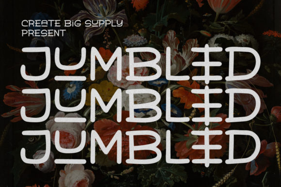
Jumbled is a display font that walks a rare line—it’s playful without being childish, elegant without feeling stiff. Its characters are generously rounded, with gentle curves and open counters that breathe on screen. There’s no sharp contrast between thick and thin strokes, no exaggerated flourishes—just thoughtful, consistent rhythm across uppercase and lowercase. That balance makes it unusually versatile for digital use: it reads clearly at large sizes, holds up well over image overlays, and scales gracefully from desktop hero banners down to mobile call-to-action buttons.
I tested Jumbled across three real layout contexts: a coaching website’s value-prop headline (“Clarity Starts Here”), a product landing page’s feature section titles (“Simple Setup”, “Real-Time Insights”, “Trusted Daily”), and a digital brand kit’s visual guidelines header (“Your Voice, Visually Defined”). In each case, Jumbled anchored the message—not by shouting, but by smiling with intention. It gave warmth to technical content and grounded whimsy in professionalism.
For readability, I checked how it performed under real conditions. On mobile, I kept headlines at 32px minimum with 1.25 line-height—no tight tracking, no all-caps unless paired with generous letter-spacing. Over light backgrounds? Crisp. Over muted image overlays? Still legible, especially with a subtle text shadow or background tint. On dark mode, I used a slightly lighter weight (if available) and increased contrast with a soft white or off-white. Jumbled doesn’t demand dramatic treatment—it rewards restraint.
That said, it’s not meant for body copy. As a display font, Jumbled shines where impact matters most: hero titles, section headers, CTA buttons, shop banners, blog post titles, course module labels, and campaign landing page accents. I used it for a portfolio site’s project category tags (“Branding”, “Web Design”, “Motion”)—small, bold, and instantly scannable. For a course sales page, I applied it only to the main headline and the “Enroll Now” button, pairing both with a neutral sans serif (Inter, set at 16px/1.6) for paragraph text. The hierarchy felt intuitive—not forced, just clear.
Font pairing is where Jumbled really earns its place in a designer’s toolkit. It pairs beautifully with clean, humanist sans serifs like Inter, Poppins, or Manrope for UI text and navigation. For a more editorial or premium feel—say, a newsletter or long-form blog—I’ve paired it with a warm, low-contrast serif like Cormorant Garamond or Literata. The contrast works because Jumbled brings personality, while the companion font brings stability. No clashing, no competition—just complementary roles in the same visual story.
Before deploying Jumbled in production, I double-checked what came in the package. It included regular and bold weights (ideal for web), WOFF2 files for fast loading, and basic Latin character support—including diacritics for common European languages. No extended Cyrillic or Arabic coverage, so I noted that for future international projects. Licensing was straightforward: commercial use permitted, including client websites and digital templates, as long as it’s not redistributed as part of a font bundle. I verified the EULA before adding it to the site’s @font-face stack—always worth five minutes to avoid surprises later.
One unexpected win? Button styling. I tried Jumbled on a “Get Started” CTA inside a testimonial card—small (20px), bold, centered, with modest padding. It didn’t look gimmicky. Instead, it added a touch of approachability to an otherwise serious quote. Users paused there longer. Not because it slowed them down—but because it felt *human*. That’s the quiet strength of a well-chosen display font: it shapes tone before a single word is read.
Of course, Jumbled isn’t for every headline. If your brand voice is strictly minimalist, high-tech, or corporate-formal, it may feel too warm. But if you’re building something that values authenticity—whether it’s a creative studio, wellness coach, indie course creator, or small-batch product brand—Jumbled adds polish without pretense. It says, “We care about craft, and we don’t take ourselves too seriously.”
In practice, I now reach for Jumbled when I need typography that does two things at once: draws the eye *and* puts people at ease. It works in Figma previews, passes WCAG contrast checks at headline sizes, renders consistently across Chrome, Safari, and Firefox, and loads quickly when optimized. Most importantly, it feels intentional—not decorative for decoration’s sake, but expressive with purpose.
So yes, I kept it in that boutique store’s hero section. And yes, the client loved it—not because it was trendy, but because it matched their voice: thoughtful, joyful, quietly confident. That’s the mark of a good display font. Not flash. Not fuss. Just the right kind of clarity, wrapped in charm.
- Best for: Hero headlines, section titles, CTA buttons, shop banners, blog headers, campaign accents
- Avoid for: Long paragraphs, data tables, dense navigation menus, legal disclaimers
- Pair with: Humanist sans serifs (e.g., Inter, Poppins) or warm serifs (e.g., Literata, Cormorant Garamond)
- Check before use: Webfont formats (WOFF2 preferred), weight availability, language support, commercial license scope
- Mobile tip: Use ≥32px for hero text, ensure tap targets remain ≥44px even with custom font rendering