Fiver: A Bold Display Font for Modern Web Design
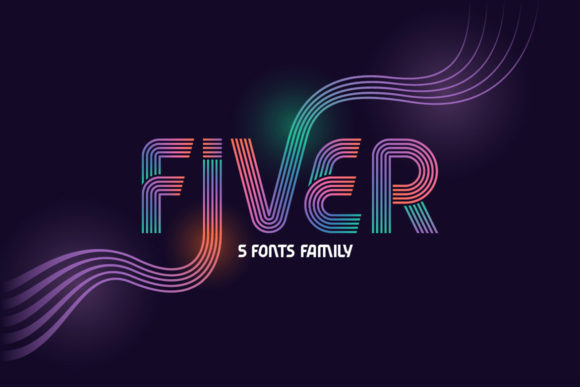
As a UI designer who builds landing pages, SaaS dashboards, and boutique e-commerce sites, I choose display fonts not just for flair—but for function. Fiver stands out because it delivers visual impact without sacrificing clarity or intention. It’s a wavy, confident display font with rhythmic curves and strong character—designed to command attention in digital spaces where first impressions happen in under two seconds.
Fiver’s boldness isn’t chaotic—it’s controlled. The letterforms lean forward with subtle motion, giving headlines energy without compromising legibility at scale. That wavy rhythm works especially well in hero sections, product launch banners, and course sales pages where you need to signal creativity, confidence, or approachability—depending on your brand tone. Unlike overly ornate script fonts, Fiver avoids visual noise. Its open counters and generous x-height ensure readability even at smaller sizes on mobile screens, as long as it’s used intentionally.
Where Fiver Fits in Your Layout System
Fiver excels in high-impact, low-frequency roles: hero titles, section headers, CTA buttons (when sized appropriately), logo lockups, and branded content cards. It’s not built for body copy—but that’s by design. As a display font, its strength lies in establishing hierarchy and mood. On a coaching website, pairing Fiver with a clean sans serif like Inter or Manrope creates instant contrast: the headline conveys warmth and personality; the supporting text delivers clarity and trust.
In an online store for handmade ceramics or indie apparel, Fiver adds texture and voice to product category banners—“New Arrivals,” “Limited Edition,” or “Studio Drop”—without competing with product imagery. For portfolio sites, it gives project titles presence while letting case study visuals remain central. And on dark-mode interfaces? Fiver holds up beautifully against deep backgrounds when set with sufficient contrast and spacing—just avoid thin weights or tight tracking.
Readability & Responsiveness: Practical Notes
On mobile, use Fiver at 32px minimum for H1s and never below 24px for H2s—even with its generous proportions. Avoid stacking multiple Fiver lines tightly; increase line-height to at least 1.3 for breathing room. When overlaying Fiver on images, apply a subtle semi-transparent background or text shadow to preserve contrast. Test on both light and dark modes: its curves read cleanly on white, but gain extra dimension on charcoal or navy.
Because Fiver is PUA encoded, accessing swashes, alternates, and stylistic glyphs is straightforward in modern design tools and CSS via … entities or OpenType features. That means you can toggle between standard and flourished ‘g’ or ‘y’ characters directly—ideal for customizing logo variants or social media graphics without needing separate font files.
Smart Pairings for Digital Consistency
Fiver pairs best with typefaces that ground its energy. A neutral, highly legible sans serif—like IBM Plex Sans, Lato, or even system fonts like -apple-system—creates reliable balance. For editorial or premium brand experiences, try a restrained serif like Literata or Crimson Pro: the contrast between Fiver’s wave and crisp serifs reinforces sophistication without stiffness.
Avoid pairing Fiver with other decorative fonts—especially other display or script fonts. That dilutes hierarchy and confuses scanning behavior. Also skip ultra-thin or condensed sans serifs; they clash tonally. Instead, anchor Fiver with a font that has similar x-height and generous letter-spacing to maintain rhythm across devices.
Licensing, Formats & Real-World Use
Fiver ships as a premium font with web-optimized WOFF2 files, making it production-ready for self-hosted sites or CMS platforms. It includes full Latin character support and basic multilingual coverage—sufficient for English, Spanish, French, German, and Portuguese markets. Check the license before deploying: most commercial licenses cover websites, client projects, SaaS apps, and digital templates, but extended rights may be needed for white-labeled products or resale of design assets containing Fiver as a core element.
If you’re building a brand kit for a creative entrepreneur, Fiver becomes part of their visual grammar—not just a one-off headline choice. Used consistently across email headers, social banners, and course modules, it strengthens recognition. In a blog header, it signals that this isn’t generic content—it’s curated, human, and intentional. That consistency builds trust faster than any tagline.
When to Reach for Fiver (and When Not To)
Reach for Fiver when you need:
- A hero title that reflects bold, modern, or expressive brand values
- Section headers on a portfolio, creative agency site, or digital product landing page
- CTA buttons where visual weight matters more than micro-interactions
- Logo text for startups, studios, or personal brands with a relaxed-but-polished identity
- Branded quote cards or testimonial highlights in marketing emails or dashboards
Avoid Fiver for:
- Long paragraphs or navigation labels
- Small interface elements like form inputs or tab labels under 16px
- Accessibility-critical text where WCAG contrast or screen reader parsing is untested
- Brands relying on strict minimalism or corporate conservatism—Fiver leans warm, not austere
Ultimately, Fiver isn’t about decoration—it’s about direction. It guides the eye, sets expectations, and quietly communicates who you are before a single word is read. In an ecosystem crowded with safe, algorithm-friendly fonts, choosing Fiver is a deliberate act of digital identity. It says: This space has personality. This brand knows its voice. This experience was designed—not assembled.