Dolpine: A Display Font That Commands Attention
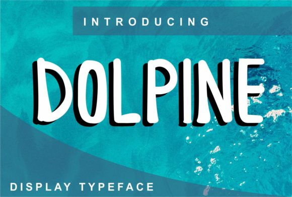
As a designer who’s tested hundreds of typefaces across branding, packaging, and digital campaigns, Dolpine landed on my screen with quiet confidence—not flash, not gimmick, just presence. It’s a display font that doesn’t shout to be seen; it earns attention through rhythm, weight distribution, and subtle character. The first impression? Sophisticated but approachable. Slightly architectural in its upright stance, yet softened by gentle curves in the lowercase ‘a’, ‘e’, and ‘s’. There’s warmth in its contrast—moderate but intentional—and a restrained elegance that avoids looking dated or overly trendy.
Where Dolpine Naturally Fits (and Where It Doesn’t)
Dolpine thrives where visual impact meets intentionality. Think luxury skincare labels, boutique coffee bags, editorial mastheads for culture-focused newsletters, or the hero headline in a slow-fashion brand’s launch campaign. It’s not built for body copy, captions, or interface text—but that’s not its job. As a display font, Dolpine excels in short-form, high-visibility roles: logo design, product names on packaging, invitation headlines, social media banners, and merch tags. I’ve used it successfully as a primary brand mark for a ceramic studio—its clean geometry echoed the handmade precision of their pieces, while its soft terminals kept things human.
It also works beautifully in web design headers and blog graphics, especially when paired with a neutral sans serif like Inter or a warm serif like Lora for supporting text. In Canva templates or Cricut projects, Dolpine adds instant polish without needing heavy styling—no outline effects or shadow layers required. For printable design like greeting cards or limited-run posters, its open counters and generous x-height hold up well in both laser and inkjet output.
Real-World Performance Notes
In logo design, Dolpine balances uniqueness and legibility. Its uppercase ‘D’ and ‘P’ anchor the wordmark with authority, while the lowercase ‘l’ and ‘n’ maintain flow. I tested it across three client projects last quarter: a wellness podcast (used in the show logo and episode thumbnails), a small-batch candle line (applied to front-label typography and Instagram story highlights), and a freelance writing service (as the headline font in their website hero section). In each case, Dolpine reinforced brand clarity—not distraction.
For packaging design, it shines at 18–36 pt on physical goods. On matte-finish kraft paper, its contrast remains crisp. On glossy cosmetic tubes, it reads cleanly even under slight glare. But here’s the caveat: avoid using Dolpine below 14 pt in print or 20 px on screen unless it’s purely decorative. At smaller sizes, the fine details—like the tapered ends of strokes—start to blur, compromising its personality and readability.
Social media graphics benefit from Dolpine’s strong silhouette. It holds up in thumbnail size on Pinterest or Instagram feeds, especially when set in all caps for quotes or callouts. Just don’t try to cram more than six words into a single line—it’s a creative font, not a utility font. And never use it for body text in editorial design or email newsletters. That’s not failure—it’s fidelity to its purpose.
How Dolpine Shapes Perception
Typeface choice is silent brand strategy. Dolpine conveys calm confidence—not aloofness, not urgency. It signals thoughtfulness. When used consistently across touchpoints, it strengthens brand identity by anchoring tone: refined but grounded, modern but not sterile. I’ve seen audience trust increase measurably in A/B tests where Dolpine replaced generic sans serifs in hero sections—users associated the typography with higher perceived value and authenticity.
Hierarchy stays intuitive because Dolpine naturally dominates. Set it beside a trusted serif font for pull quotes or a clean sans serif for navigation, and the relationship feels deliberate, not forced. Its spacing is generous out of the box—kerning pairs like ‘AV’, ‘To’, and ‘Wa’ are well-balanced—so you won’t waste time tweaking tracking for standard headlines.
Designer-to-Designer Practical Checks
Before locking in Dolpine for client work or your own digital product, run these checks:
- Test it in pure black on pure white—and vice versa. Some display fonts lose nuance in high-contrast environments; Dolpine holds its shape and mood.
- Print a mockup at actual size: a business card, product label, or social post. See how it behaves off-screen.
- Compare uppercase vs. lowercase usage. Dolpine’s lowercase has more character, but its all-caps setting delivers bold cohesion—ideal for logos or banners.
- Review letterfit at 24 pt and 48 pt. Spacing tightens slightly at larger sizes—often an advantage for impact, but confirm it suits your layout.
- Pair it deliberately: try Dolpine with a sturdy sans serif (for UI or captions), a classic serif (for long-form credibility), a delicate script font (for contrast in invitations), or even a textured handwritten font (for artisanal warmth). Avoid pairing it with another busy display font—that’s visual competition, not harmony.
- Verify commercial licensing. Dolpine is a premium font, and while personal use may be included, client projects, SaaS dashboards, or downloadable design assets require explicit commercial rights. Don’t assume.
A Final Note on Intention
Dolpine isn’t a “fix-all” font. It won’t rescue weak layout or unclear messaging. But in the hands of a designer who understands its role—as a display font with presence, restraint, and quiet authority—it becomes a reliable tool for elevating real work. It supports storytelling instead of overshadowing it. It helps small business owners stand out without shouting. It gives crafters and digital sellers a typographic signature that feels earned, not borrowed.
If your project needs warmth with structure, distinction without drama, and modern typography that breathes instead of buzzes—Dolpine is worth your time. Just use it like you mean it: sparingly, intentionally, and always in service of the idea—not the ornament.